
This series of blog posts which I have converted from Youtube videos. I personally have really enjoyed these videos so in order to textually document them, these are essentially some screenshots and rough notes organised.
This particular post is based on the awesome Ekaterina Orlova & Thomas Burleson at AngularConnect 2017 talk. It can be found on the link below: https://www.youtube.com/watch?v=geqjUtKJX5s
HTML Layout
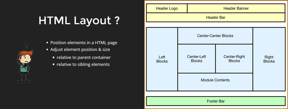
Layout Techniques
There are different layout techniques:
- Table
- Float, position, clear
- CSS Grids
- FlexBox CSS
Why FlexBox CSS?
FlexBox CSS actually features, the flow of elements. The main concept is that there is a container where the child elements are contained which are aligned to access.
Down below is the box model, which is optimized for user interfaces. It shows two concepts of the axis. One horizontal axis, which is aligned from left to right. Secondly, the cross axis, the vertical one, which elements are related to.
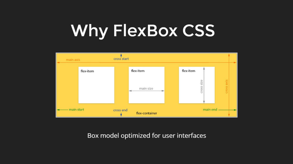
In order to use the FlexBox in the best possible way, it is important to realize it as a flow of elements.
How to think about FlexBox?
Two things to think about. Firstly, the container flow and secondly, the child size.
-
Flow
The flow can be horizontal or vertical.
-
Size
The size of the children can either be fixed or in ratios.
The containers define the direction of the flow. The children define size, offset and order as to how the elements will appear and how powerful they are and what enables the layout usage of FlexBox is that those containers can be nested.
A flex container can contain multiple flex containers which have their own flex directions which enable the person to almost anything or everything with FlexBox.
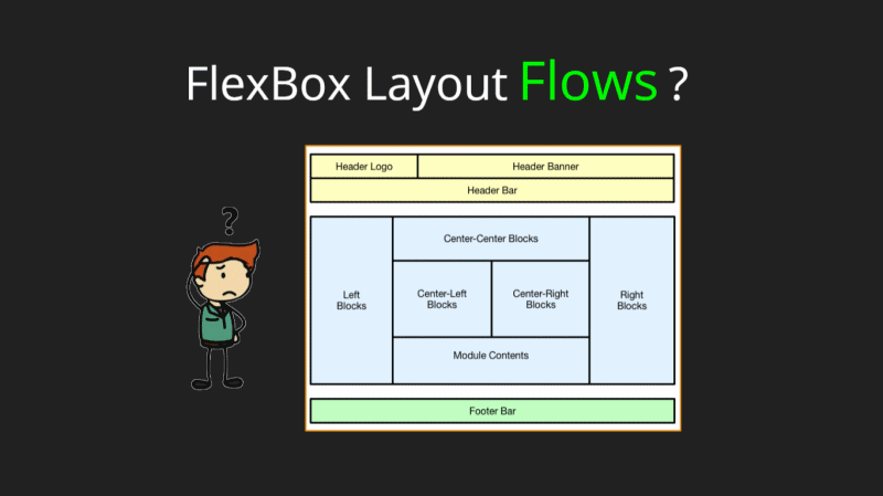
FlexBox Layout Flows
When the above statements are set, the FlexBox layout flows.
The header is at the top, the content area is in the center and the footer is at the bottom.
They key is to think of the layout from outward to inward.
The first axis or the first flow is from the top to the bottom. It is a column layout, where elements flow vertically. Here, the horizontal flow works the best. The first two elements are positioned horizontally and the rest where the third elements are not left with enough space.
The column layout can be used here as well.
The figure down below shows three sections flowing horizontally from left to right. And then the middle section is dealt with the similar approach.
The figure down below shows the decomposition of the outside, the inward thinking behind it. It is an easy approach.
The element sizes must be considered when using the FlexBox. This is how the FlexBox is told where everything should be rendered as a page.
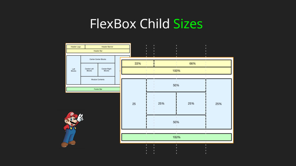
The header takes up the 33 percent while the second element takes up 66 percent.
Using @angular flex layout
- It is a standalone library
- It does not have any CSS style sheet
- It offers typescript implementations
- It is inline CSS also, dynamically injected
- It has Static API
- It has Responsive API
- It is independent of Angular material. So it is not required to be used at all if it is not needed, or it can be combined together as they work perfectly together
- It has Angular CLI integration
Install Angular Flex layout components
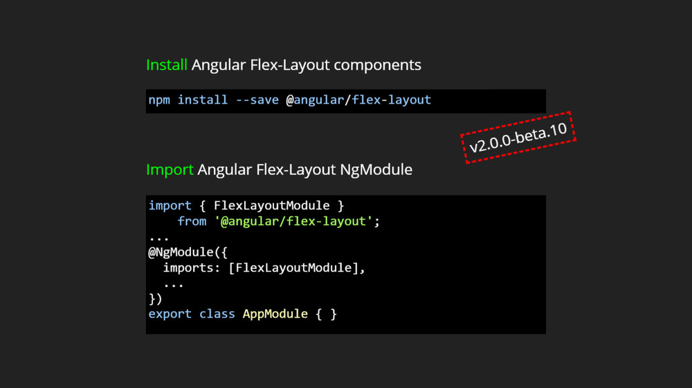
Once, installation of the flex layout is done, it is imported to the angular flex layout NgModule.
Static API
- It is declarative and has directives which can be used in HTML
- It also supports data binding
- It builds CSS, dynamically injected inline
- It supports change detection
- It includes fxHide and fxShow features
- It is quite performant
When the inline is injected, actually the styles are being injected in the styles attributes. It has the highest specificity and it can override anything else.
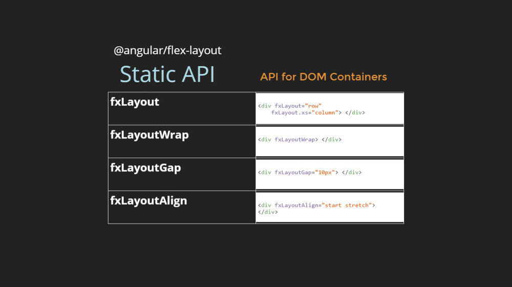
- Fxlayout defines the flex directions
- FxLayoutWrap defines whether the elements should wrap or not
- FxlayoutGap defines the spacing between the elements
- FxLayoutAlign defines how the elements should be aligned
FxLayout API
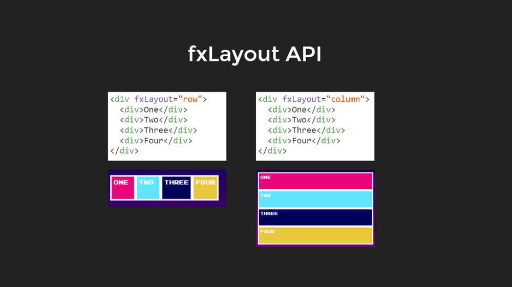
A couple of examples are shown below, which shows how the element will look like when they are aligned in rows and columns.
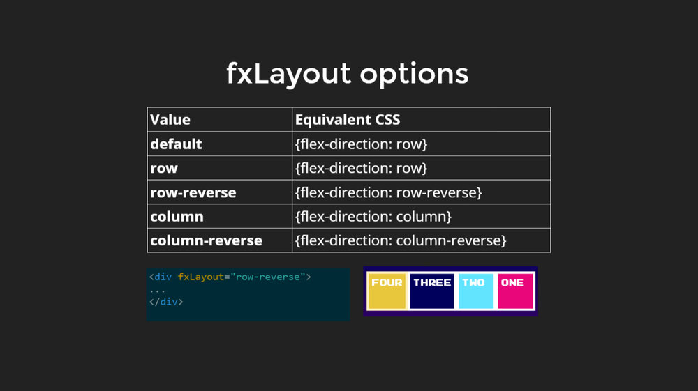
fxLayout have some options as well so that the elements are aligned from right to left as well. Hence, a bi-directional logic is applied.
There are some other APIs for container children. The previous APIs were for the containers.
Flex is specified along with the size and how the elements should flex.
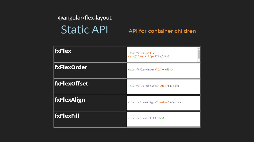
There are fxflex, fxflexorder, fxflexoffset, fxflexAlign and fxflexfill. All offer different purposes.
// TODO please add some one line detail on what each is for
fxFlex API
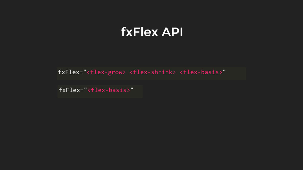
Flex grow
It defines how the elements should grow proportionally to the other elements of there is any space available.
Flex shrink
Flex Shrink is how the elements should shrink. It defines how much a flexbox item should shrink if there is not enough space available.
Flex basis
Flex basis is what is needed to be a default procedure. It controls the default size of the element.
Down below is an example of how the element will grow.
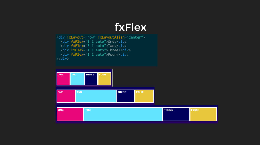
The second element is given the flex grow 35, so if there is no space, they will be equally big.
fxFlex Options
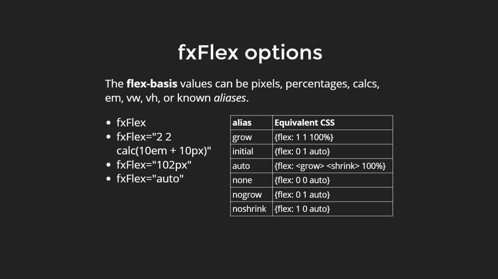
Here it can be seen that what is the markup and it can be altered.
Change the direction from row to a column. The elements can be aligned differently like in the center or in the event space between or space around.
- It can be more visible if the direction row is used.
- It can also be aligned on the different axis.
The figure shows the elements that have used layout fill to fill all the available spaces.
In an example of the consequence, when the flex value is not defined. If the flex is used, it uses all the available spaces.
The example shows what happens when elements do not fit here. It is an example with layout Wrap.
Responsive UX
It allows the elements to adapt which element s are shown, which if they are visible, their sizes altered according to the devices.
It is required to change the containers and the elements based on the window sizes.
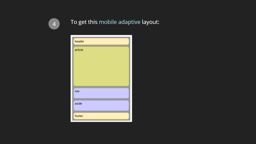
Here is an example of the desktop layout and mobile layout.
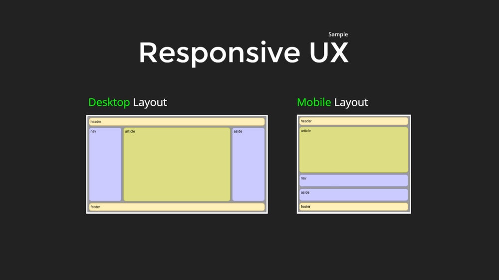
In the mobile layout, where everything floes vertically, but there is a change in the order.
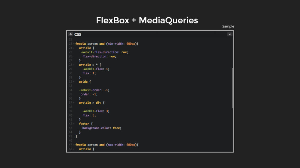
In order to make Adaptive UX, Flexbox CSS is required along with the Media Queries.
Responsive API
Responsive API can be used along with flex layout library in order to help the apps adapt.
It uses FlexBox CSS under the hood. It uses responsive resizing and responding. It uses the markup in the HTML layer. It can be used without having to worry about the media queries.
The responsive API is built off the material design specifications, where they identify breakpoints. It uses media queries to define these pixel ranges
Material Design
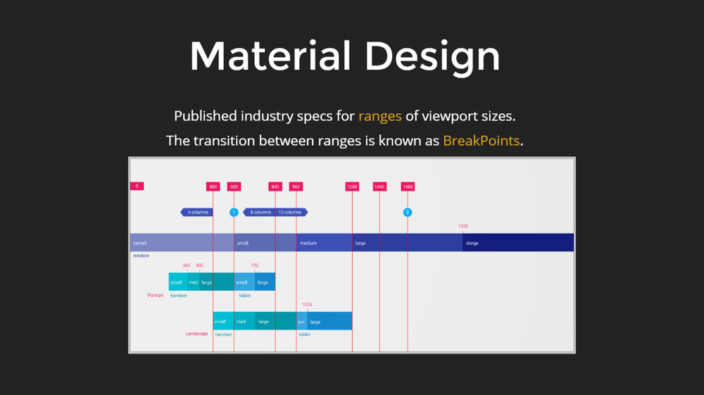
Here is an example of what comes out of the specifications documents.
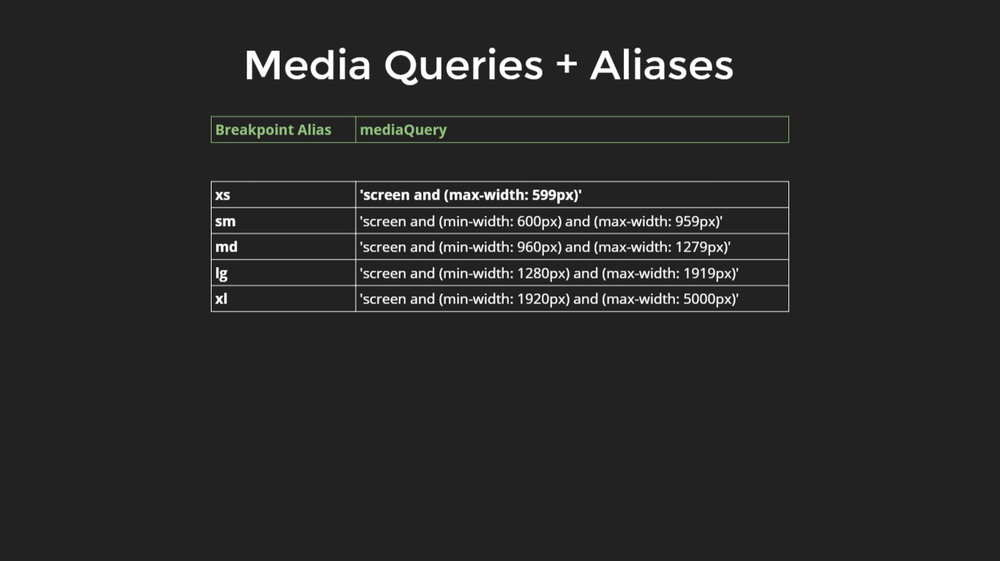
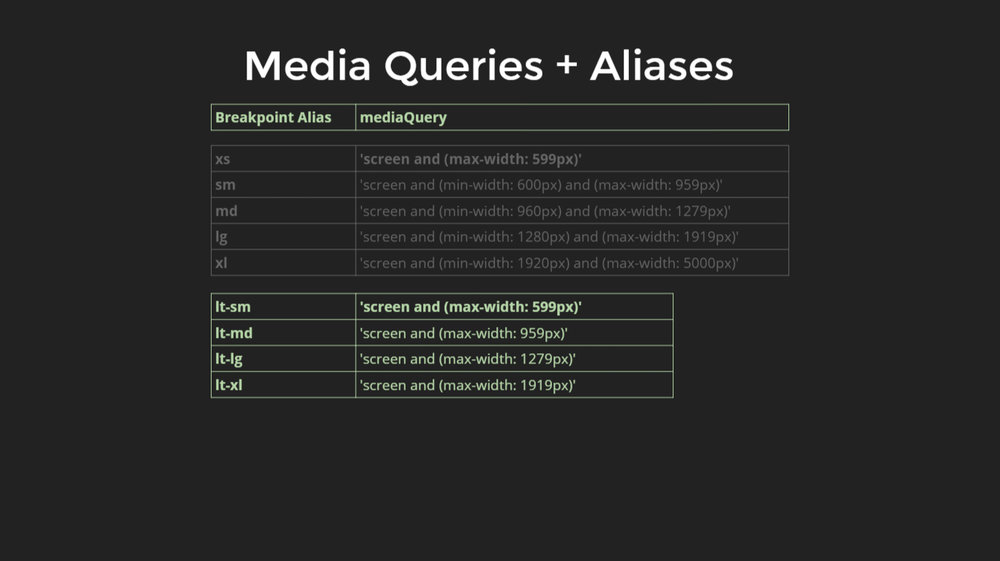
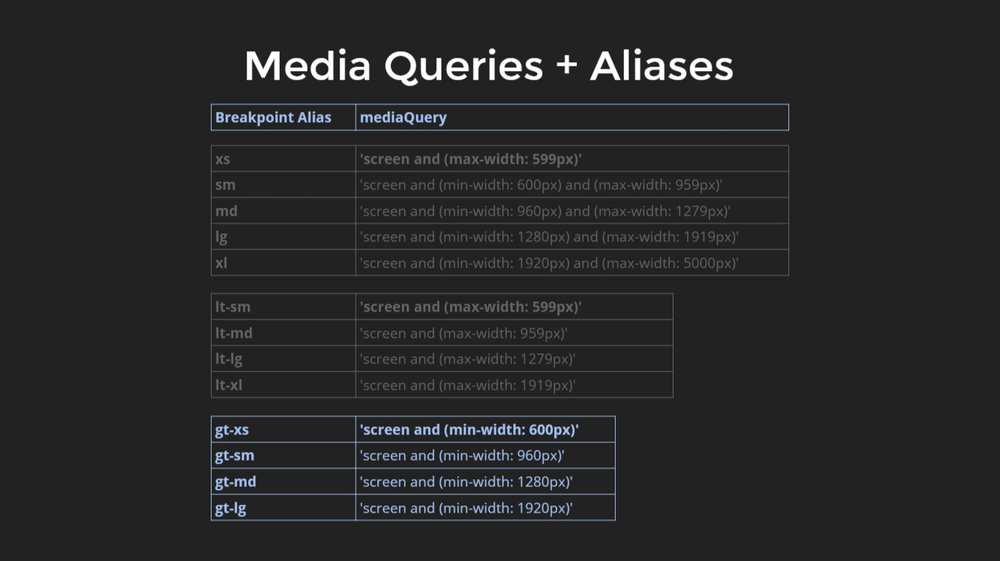
Here, the range ‘extra small’ is anything less than 600 pixels and ‘small’ is anything less than 960 pixels horizontally. Other than these, there is large and extra-large. These names associated with the ranges can be reduced to their respective aliases. And then associate these aliases with specific media query ranges.
There can be logic which does not fit right with these ranges. For, that there is another defined set, where the values are less than small, which can be an equivalent of extra small.
These defined aliases can be combined with a specific API, which is published with the Angular Flex Layout.
Responsive HTML API
This is a very declarative API because it is used in HTML.
To build a desktop adaptive layout, start with the HTML.
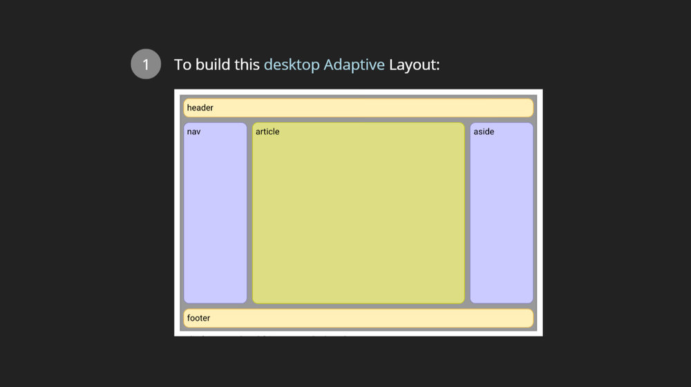
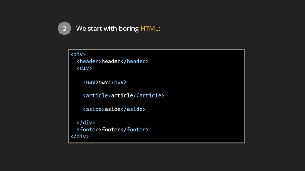
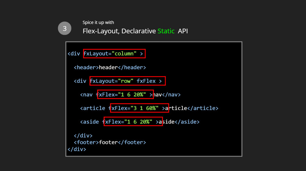
Here is the HTML with a header, the content area, nav and the article on the side.
Add flex layout declarative Static API for columns, rows and different sizing that are required to be done.
Now that the desktop layout is done, the mobile layout has to be set up similarly.
Go back to the HTML markup and add flex layout responsive API. The default will be in a row but the extra small will be in the column. The order can be changed. Hence, it allows the app to adapt from desktop to mobile devices.
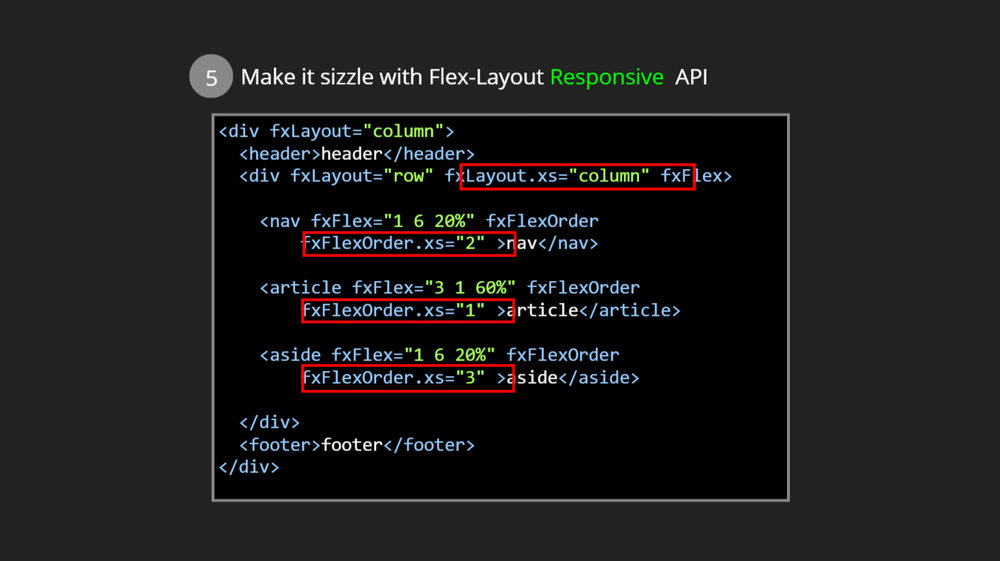
When the window is shrunk, it goes to the vertical layout automatically.
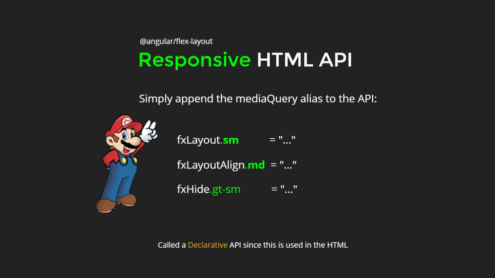
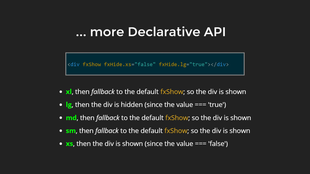
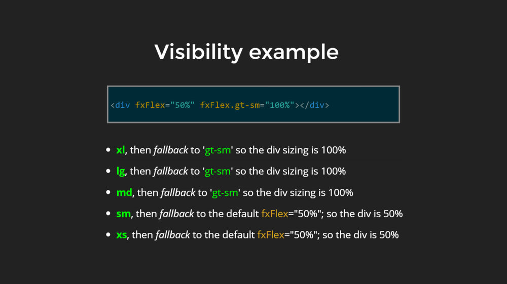
This API has fxShow and fxHide which defines which elements should be shown or kept hidden. It can be extended with the responsive suffixes.
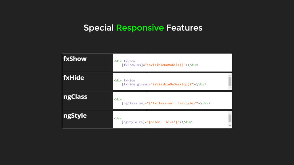
Here is the logical explanation; there are some special responsive features, fxshow, fxhide, ngclass and ngstyle.
The YRL can be changed using this responsive API.
JavaScript Imperative API
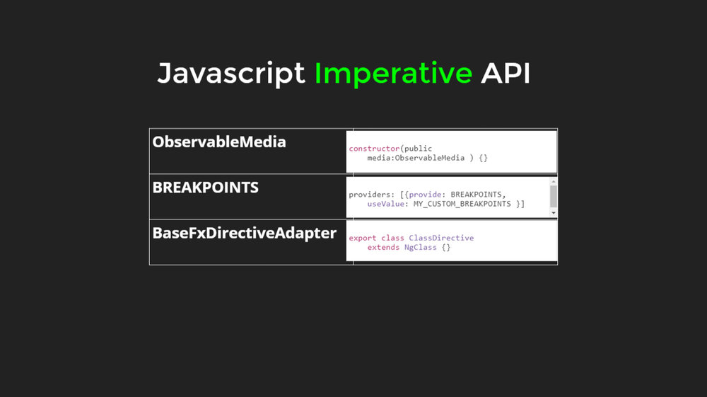
Observable media is available in this API along with the feature if defining breakpoints and other API extensions.
Subscribe to media query activations
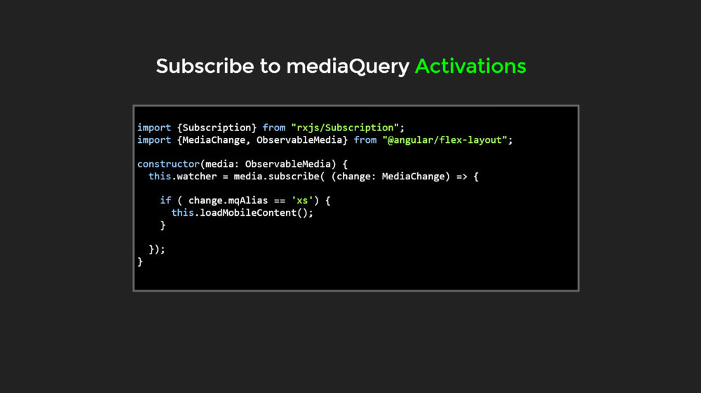
When the range on a mobile device activates, the mobile-specific content needs to be loaded. This is how the business logic can be adjusted listening to the media query engine.
Very well explained, Thank you very much!
Good luck
XO
Can you please disable the auto-play in your slides, they are near impossible to read because they keep moving!
@Purple Edge, these images are from a presentation done by Ekaterina Orlova & Thomas Burleson at AngularConnect in late 2017. Here’s a video that you can pause and get a good look at them https://youtu.be/geqjUtKJX5s
Nice
Disable image slide show